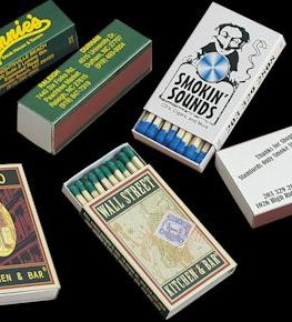
For all of your business' advertising match book and match box need go to: GetMatches.com
We now are proud to announce that we've reintroduced Feature Matches (match books containing specially printed match stems). Call us at 800.605.7331 to discuss producing your collectible match books!
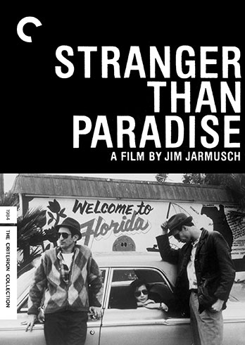
The Movie Paterson directed by Jim Jarmusch Features a Love Poem Inspired by Matches!
In the opening scene in the movie paterson, Adam Driver named Paterson plays a bus driver for the Paterson NJ Transit who breaks up the monotony of his life by writing original poetry based upon observations of the world around him.
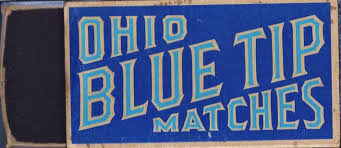
The first poem that the film opens with that he writes is a Love Poem inspired by his collection of OHIO BLUE TIP matches (that was originally written in 1979 by the real poet Ron Padgett as a love poem to his wife).
The poem goes into great detail about his collection of household's match boxes, the construction of the match boxes and their match sticks and focuses intently on the color of the blue tip (match heads).
The Original Ohio Blue Tip Match Box
I've been a big fan of Jim Jarmusch - IMDb since his first indie film Stranger Than Paradise (1984) and matches have always played a part as a plot device in most of his films!
Jim Jarmusch's first film Stranger Than Paradise
To design and order your business' advertising matches check us out at TheMatchGroup .
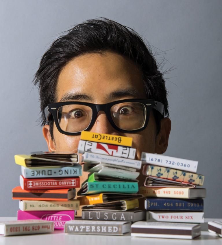
Mr. Alvin Diec (34) co-owner of Office of Brothers is one of our favorite designers! He and his six person team create some of the most graphically inspired branding for his impressive list of restaurants & restaurant groups that are located primarily in the Atlanta area.
He's a true believer in the power and efficacy of match advertising and makes a point to include an advertising match design in every one of his restaurant or non restaurant corporate branding presentation! The compelling match designs that he and his team create (and that we produce) become instant collectibles! Restaurants and businesses use their matches as a brand extension and as a "Functional Business Card".
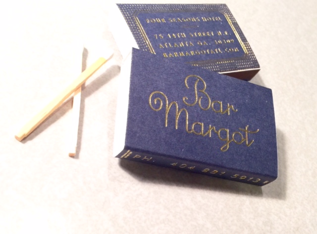
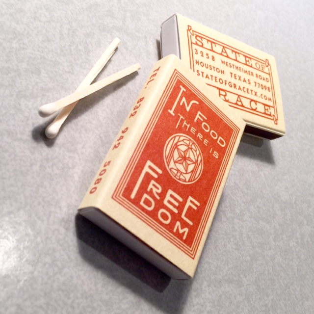
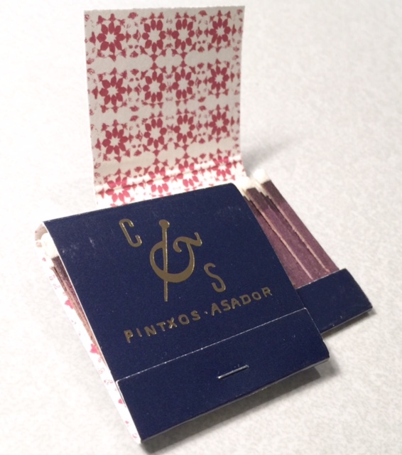
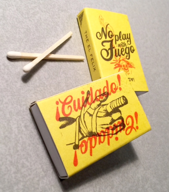
Here are some pics of match books and match boxes that we've produced for Alvin's restaurant clients.
Bar Margot BXQ3 USA Made Match BoxState Of Grace Match Box Made in the USACooks & Soldiers Match BookEn Fuego Match Box Made in the USA
To design and order your business' own collectible matches GoTo TheMatchGroup
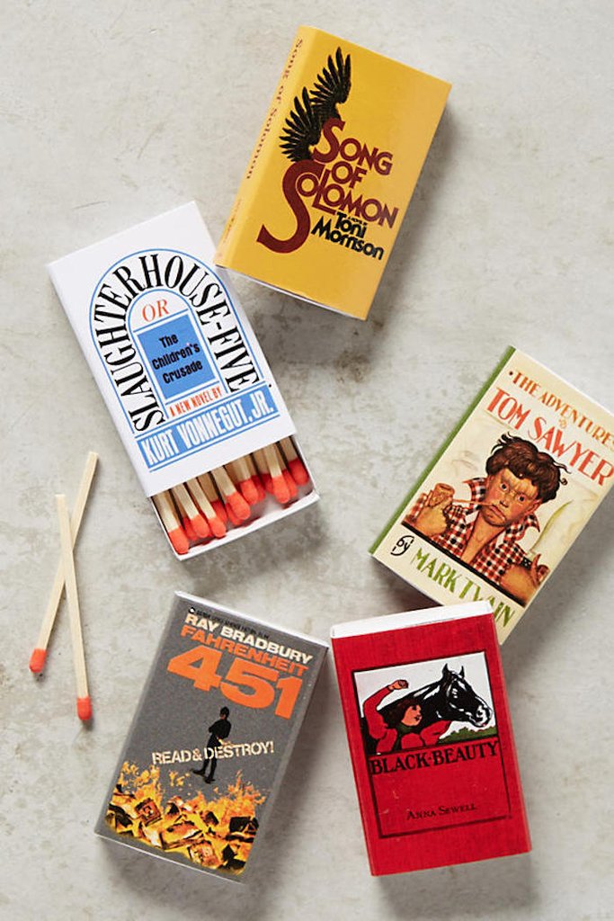
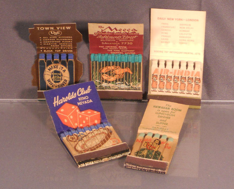
A great article on the joy of collecting matches when traveling!
"...I've recently begun picking up matchbooks whenever I go somewhere interesting. They're the ideal memento. Easy to pack, utilitarian and free of charge. And even though they don't cost you a thing, they still possess a certain exclusive cool factor. After all, the only way you can get a matchbook is to actually step inside that hotel, bar or restaurant."
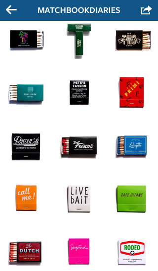
The author went on to write: "The more obscure the better too. A roadside diner in California's wine country, the London cocktail lounge tucked away in a hidden courtyard, an old school power lunch spot in Washington, DC and one of the best taco joints in all of Texas. They're each so uniquely telling, it's no wonder they've become optimal Instagram fodder" For example, Instagram pages that feature ONLY advertising matches that are artfully posted by a gentleman named Charlie @matchbookdiaries have over 15,000 avid followers!
Cory expressed the unique feelings that he experiences when he views his match collection:"...The memories of those nights and who I spent them with come flooding back as soon as I see the colorful, graphic cover on the front of the matchbook or box".
The article closes with an astute perspective from a collector of matches (called a "Phillumenist") about the businesses that continue to distribute their logo matches despite the country's ban on smoking by "...establishments still committed to offering them, know the value of making them interesting and eye-catching. The kind of swag you want to keep around long after your visit."
We at TheMatchGroup couldn't agree more!
This terrific article references all stripes of ephemera that collectors post to Instagram and singles out the popularity of picturess of matches that are featured by users with thousand's of followers on the site.
An Instagrammer, Bill Rose (@junktype) was quoted: “Most of the objects in my feed are no bigger than a couple of inches wide. They are often so small that my phone has trouble focussing given the close range of my subject.
Confirming Bill Rose's point, another popular Instagrammer, Charles Clarke (@matchbookdiaries) [with almost 13,000 followers] who's page exclusively concentrates on pictures of matches who shoots his matchbooks against a white background was quoted: “I use the white background because it looks clean, and because you can scroll my profile page and it doesn’t look like there are any dividers between the photos. It looks like a big poster.”
All lot of graphic designers refer to Instagram as a means of being plugged into the latest trends in design and to provide inspiration.
The article's author, ALEXANDRA LANGE reached out to Ara Devejian (@LetterGetter), a creative director and by way of his background she quoted him stating: “[he] started his [Instagram account] when he moved to Los Angeles’s superlatively-signed Theatre District. Every day, I try to take a new route to work or wherever, especially going way out my way to discover new places on my bike or in the car, and in turn LetterGetter is the happy byproduct of that curiosity.” At first Devejian wanted to document typographic nightmares—the illegible, the mishandled—but, as with most Instagram accounts, things swung over to the positive. The platform’s users have such a strong preference for things that are pretty (however you define it) that it’s difficult to swim against the tide of posting “bests” rather than “worsts.” “@LetterGetter helps inform some of the typographic projects I work on,” Devejian said, “like the title card I designed for Gymkhana 7. The style of the photos is intentionally flat or sparse in order to see the letterforms as they were conceived.” He goes on to say: “People have yelled at me—thinking I’m about to steal or break something—and then afterwards, realizing that I’m only taking pictures and admiring their car or whatever, tell me their life story,” Devejian says. “I’ve become painfully accustomed to just how fleeting signage is. It’s made me wonder whether I should become some sort of advocate for preservation, in attempt to postpone their inevitable disappearance.”