The New Yorker Magazine Instagram’s Ephemera & Popularity Of Matchbooks!
The New Yorker Article Re. The Popularity of Instagramming Ephemera -Featuring Advertising Matches!
MARCH 24, 2015Instagram’s Endangered Ephemera
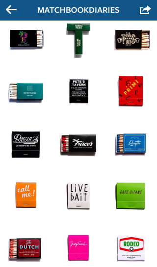
www.instagram.com/matchbookdiaries
This terrific article references all stripes of ephemera that collectors post to Instagram and singles out the popularity of picturess of matches that are featured by users with thousand’s of followers on the site.
An Instagrammer, Bill Rose (@junktype) was quoted: “Most of the objects in my feed are no bigger than a couple of inches wide. They are often so small that my phone has trouble focussing given the close range of my subject.
Confirming Bill Rose’s point, another popular Instagrammer, Charles Clarke (@matchbookdiaries) [with almost 13,000 followers] who’s page exclusively concentrates on pictures of matches who shoots his matchbooks against a white background was quoted: “I use the white background because it looks clean, and because you can scroll my profile page and it doesn’t look like there are any dividers between the photos. It looks like a big poster.”
All lot of graphic designers refer to Instagram as a means of being plugged into the latest trends in design and to provide inspiration.
The article’s author, ALEXANDRA LANGE reached out to Ara Devejian (@LetterGetter), a creative director and by way of his background she quoted him stating: “[he] started his [Instagram account] when he moved to Los Angeles’s superlatively-signed Theatre District. Every day, I try to take a new route to work or wherever, especially going way out my way to discover new places on my bike or in the car, and in turn LetterGetter is the happy byproduct of that curiosity.” At first Devejian wanted to document typographic nightmares—the illegible, the mishandled—but, as with most Instagram accounts, things swung over to the positive. The platform’s users have such a strong preference for things that are pretty (however you define it) that it’s difficult to swim against the tide of posting “bests” rather than “worsts.” “@LetterGetter helps inform some of the typographic projects I work on,” Devejian said, “like the title card I designed for Gymkhana 7. The style of the photos is intentionally flat or sparse in order to see the letterforms as they were conceived.” He goes on to say: “People have yelled at me—thinking I’m about to steal or break something—and then afterwards, realizing that I’m only taking pictures and admiring their car or whatever, tell me their life story,” Devejian says. “I’ve become painfully accustomed to just how fleeting signage is. It’s made me wonder whether I should become some sort of advocate for preservation, in attempt to postpone their inevitable disappearance.”
To order your branded matches go to GetMatches.com Check out TheMatchGroup’s Instagram Page
![]()